
TL;DR:
- Proper digital printing practices, including color management, substrate choice, and preflight validation, are essential to reduce waste and ensure consistent quality. Accurate file preparation aligned with viewing distance, automating validation processes, and managing substrates carefully lead to fewer reprints and higher yield. Strict adherence to standards and proactive quality control significantly improve profitability and customer satisfaction in digital printing.
Getting digital printing right costs less than getting it wrong. A single bad batch from poor file prep or mismanaged color can mean reprints, wasted substrate, and missed deadlines. For small business owners, print shop managers, and independent artists, understanding the best practices for digital printing is what separates consistent, profitable output from expensive trial and error. This guide cuts straight to the practices that matter most: file preparation, color management, substrate selection, workflow control, and the mistakes that quietly drain your margins every week.
Table of Contents
- Key takeaways
- 1. Master color management before the file leaves your desk
- 2. Match your resolution to viewing distance, not habit
- 3. Run preflight as if your reputation depends on it
- 4. Choose substrates that match your printing technology
- 5. Handle rolls carefully to prevent production waste
- 6. Automate preflight validation to reduce file failures
- 7. Lock in color tolerances to improve yield and cut waste
- 8. Common mistakes that cost you more than you realize
- What I’ve actually learned from working in digital printing
- Why Transferkingz is built for these standards
- FAQ
Key takeaways
| Point | Details |
|---|---|
| Color management starts upstream | Convert files to CMYK and embed ICC profiles before sending to the RIP to avoid dull, inaccurate prints. |
| Resolution depends on viewing distance | Match image DPI to how far away viewers will stand, not a default 300 PPI for every job. |
| Preflight is a formal contract | Treat preflight specifications as binding requirements, not suggestions, to reduce reprints and delays. |
| Substrate choice drives quality | Matching paper and film properties to your print technology prevents waste and improves output consistency. |
| Automate validation early | Automated preflight catches file failures before they hit the press, reducing production disruptions by a significant margin. |
1. Master color management before the file leaves your desk
Color inconsistency causes more large format reprints than any other single factor. The root problem is almost always unmanaged RGB to CMYK conversion, which strips vibrancy and flattens blacks in ways that are nearly impossible to fix after the fact.
The fix is simple but non-negotiable: convert your artwork to CMYK before submission unless your print provider explicitly runs a managed RGB workflow. Beyond the color mode, embed substrate-specific ICC profiles so your RIP interprets color the way your output device actually behaves. Soft-proofing in Adobe Photoshop or Illustrator lets you simulate how a print will look on a specific substrate before you commit a single sheet.
A few specifics that save real money:
- Use soft-proofing with the correct ICC profile for your substrate to catch unexpected color shifts before printing.
- Avoid letting the RIP handle RGB to CMYK conversion without a specified profile. This is where dull blacks and washed-out mid-tones come from.
- For vibrant color accuracy, work in the widest appropriate color space during design, then convert at the end.
- Save final files as PDF/X-1a or PDF/X-4, which lock in color profiles and prevent unmanaged conversions downstream.
Pro Tip: If you are supplying files to a vendor, ask for their ICC profile and proof against it before you submit. One soft-proof session will catch color problems that would otherwise become a reprint.
2. Match your resolution to viewing distance, not habit
Most designers default to 300 PPI for everything. That habit creates unnecessarily large files without improving the visible quality of large format prints. HP’s guidance is direct: match your image resolution to the intended viewing distance and you will avoid both oversized files and pixelated output.
The practical thresholds look like this:
- Photos for close viewing (under 18 inches): 240 to 300 PPI
- Signage viewed at 3 to 6 feet: 100 to 150 PPI
- Large banners viewed from 10+ feet: 72 to 100 PPI
- Vector logos and line art: Always keep as vectors. Convert to high-resolution raster only when the RIP requires it.
What trips people up most is scaling. A 300 PPI image scaled to 120% in your layout drops to roughly 250 PPI effective resolution. That is often fine, but if you scale an already-marginal image further, you will see pixelation in the final print even though the source file “looks fine” on screen. Always check effective DPI after your final scaling, not just the original file’s metadata.
3. Run preflight as if your reputation depends on it
It does. Up to 30% of print files fail upload validation due to resolution errors, wrong color modes, or missing bleed. That statistic should make any print shop manager uncomfortable, because every one of those failures is a delay, a conversation, and often a reprint.
Preflight is not a courtesy check. Treat it as a formal contract with exact specifications: DPI thresholds, bleed dimensions, CMYK profiles, PDF/X standards, and font embedding requirements. Requiring proof approval before production eliminates ambiguity and puts accountability where it belongs.
The critical parameters to verify every time:
- Color mode (CMYK confirmed, no stray RGB objects)
- Minimum bleed (typically 0.125 inches for most digital print jobs)
- Fonts embedded or converted to outlines
- Transparencies flattened
- Overprint settings previewed and confirmed
- Effective DPI at final scale, not just original file DPI
- No low-resolution raster images embedded in vector files
A resource like the 30-point artwork check from Kukoo Creative gives you a structured checklist that covers the full range of pre-press variables. Pair it with automated preflight software and you create a two-layer quality gate that catches issues before they reach the press.
4. Choose substrates that match your printing technology
Print quality does not start with the press. It starts with the material you feed into it. WAN-IFRA’s 2026 analysis found that handling, humidity, and substrate choice must be optimized for the specific print technology in use to balance quality, cost, and waste reduction.
For digital printing on textiles and films, the compatibility between ink chemistry and substrate surface determines adhesion, color saturation, and durability. Running an aqueous inkjet press with a substrate designed for solvent-based inks will produce results that look wrong no matter how perfect the file is.
Practical steps for substrate selection:
- Confirm ink and substrate compatibility with your press manufacturer before ordering large quantities.
- Condition paper and film rolls in the print environment for at least 24 hours before production to equalize humidity.
- Store rolls horizontally on padded supports, never standing upright, to prevent edge distortion and uneven winding.
- Match surface finish to application: matte substrates hide minor banding artifacts better than gloss in large-area fills.
Pro Tip: For roll-fed production, inspect every roll for proper winding tension before it goes on the press. Loose or uneven winding causes lateral drift that ruins registration, and no software fix will correct a mechanical substrate problem mid-run.
5. Handle rolls carefully to prevent production waste
Roll handling issues like telescoping and coneing cause misalignment that destroys print registration, even when the file is perfect and the press is calibrated. This is one of the most underestimated sources of waste in roll-to-roll digital printing, and most of the damage happens before the job starts.
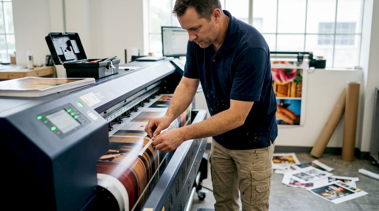
Telescoping occurs when roll layers shift laterally during handling or storage, creating an uneven edge. Coneing happens when the core deforms under improper storage pressure. Both create tension inconsistencies that the press cannot compensate for, leading to skewed prints and wasted substrate.
Beyond the roll itself, the mechanical condition of your unwind spindle and tension control system matters. A spindle with worn bearings introduces micro-variation in feed tension that shows up as banding or misregistration in long runs. Inspect and service these components on a regular schedule, not just when problems appear.
6. Automate preflight validation to reduce file failures
Manual preflight checks by a skilled operator catch most problems. But humans are inconsistent, especially under volume pressure. Automated validation shifts preflight from a reactive human check to a proactive quality gate that runs every time, at the same standard, without fatigue.
The workflow change is straightforward. Files are submitted through an automated preflight system that checks all defined parameters and either passes, flags, or rejects each file with a specific error report. Customers or designers get instant, specific feedback rather than a vague “your file has issues” message two hours before their deadline.
For print shop workflow efficiency, automated validation does more than catch errors. It standardizes what “acceptable” means across your entire operation. Every operator, every shift, every customer is held to the same file specification. That consistency is what allows you to make quality guarantees.
7. Lock in color tolerances to improve yield and cut waste
Running jobs without defined color tolerance targets means your quality standard is subjective. Two operators will approve or reject the same print based on personal judgment, and your customers will notice the inconsistency before you do. Standardizing to ΔE ≤ 3 as your color difference threshold is a concrete, measurable target that ties acceptable variation to a number rather than an opinion.
Printrunner’s 2026 data shows that tightening color tolerances and locking process controls can push first-pass yield from roughly 80% up to 88 to 92%. For a busy print shop, that difference represents a significant reduction in reprints, substrate waste, and operator time.
The practical setup involves profiling your press regularly, storing press profiles by substrate and ink set, and documenting your tolerance targets in writing. For DTF printing specifically, this approach to color accuracy gives artists and brands the confidence that a repeat order will match the original.
8. Common mistakes that cost you more than you realize
Even experienced operators make these errors consistently. Catching them before they become habits saves real money.
- Sending RGB files when CMYK is required. The RIP will convert them, but not the way you want.
- Skipping bleed on complex designs. A 1 mm shift in cut registration on a bleed-free file creates a white edge that looks unprofessional.
- Not embedding fonts. If a font is missing on the production system, the RIP substitutes the closest system font, which is rarely close enough.
- Ignoring scale effects on DPI. An image that looks sharp at 100% in your layout software may be printing at 200% of its intended size.
- Skipping the overprint preview. Black text set to overprint on a colored background disappears entirely in some workflows. Check it every time.
- Poor roll storage. A roll that has been standing on its end for two weeks is already damaged. The print will show it.
The DTF transfer quality checklist from Transferkingz covers many of these failure points in practical detail. Worth keeping in your production workflow.
What I’ve actually learned from working in digital printing
Managing color upstream is the practice I see overlooked more than any other. People spend hours troubleshooting dull prints, banding, and muddy blacks at the press level when the problem was baked into the file before it was ever submitted. The RIP is not a color correction tool. It is an interpreter, and it interprets ambiguity badly.
I’ve also found that roll handling gets treated as a logistics problem rather than a print quality issue. Operators will blame the press, the ink, or the file before they check whether the roll was stored correctly or loaded with the right tension. In my experience, checking the mechanical condition of your substrate handling system fixes about 20% of “mysterious” quality complaints faster than any software adjustment.
The hardest sell in any shop is treating preflight as a contract rather than a suggestion. When specifications are documented and proof approval is required before production starts, the whole operation tightens up. Reprints drop. Customer complaints drop. The conversation stops being “why did this print badly” and starts being “here is what we agreed to and here is how we delivered it.” That shift in framing changes everything about how a shop operates.
Automation helps, but it does not replace judgment. Automated preflight catches what you define. A human review catches what you forgot to define. Both matter.
— Anthony
Why Transferkingz is built for these standards
Transferkingz built its DTF transfer service around the same principles this article covers: precise file handling, consistent color output, and substrate compatibility that actually delivers. If you’ve been running into pixelation, dull colors, or registration issues with other vendors, the problem is usually upstream, and Transferkingz’s workflow is designed to catch it before your order hits production.
For anyone working with complex artwork, the intricate print capabilities of Transferkingz’s DTF film handle fine detail and sharp edges in ways that standard screen printing simply cannot match. Texas-based customers can explore custom DTF printing with fast local turnaround. And whether you are running a single design or building a gang sheet for a full production run, Transferkingz delivers without minimum order requirements, so you can apply these best practices without committing to volume you don’t need.
FAQ
What color mode should digital print files be in?
Convert files to CMYK before submission unless your print provider runs a managed RGB workflow. Unmanaged RGB to CMYK conversion in the RIP produces dull blacks and inaccurate mid-tones.
What DPI should I use for large format prints?
Match DPI to viewing distance rather than defaulting to 300 PPI for every job. Signage viewed from 6 feet can print at 100 to 150 PPI without any visible quality loss.
How does scaling affect image resolution?
Scaling an image up in your layout reduces its effective DPI proportionally. A 300 PPI image scaled to 120% prints at roughly 250 PPI effective resolution, which may cause pixelation if the original was already marginal.
Why do so many print files get rejected at upload?
Up to 30% of files fail validation due to wrong color mode, missing bleed, or low resolution. Automated preflight catches these issues before they cause production delays.
What is a safe color tolerance target for digital printing?
A ΔE ≤ 3 color difference threshold is the standard used by production shops to define acceptable variation. Locking this tolerance into your workflow can push first-pass yield from around 80% to 88 to 92%.
0 comments